Fact or Fiction

One of the important tasks of a good journalist is checking whether the facts written in a story are actually true. In order to do so, the writer needs to consult the original sources. A team of three researchers, Genya van Belzen, Frank Nogarede and Corella Treure, investigated different articles from the Algemeen Dagblad (AD). Before we go to the conclusion (which is based on our own experiences), we give short summaries of the [3] checked articles.

[1] “1 op 4 kinderen in reservaat misvormd door alcoholisme
This article aims to inform the reader of the severity of alcoholism in Pine Ridge reservation in South Dakota, USA. It is one of the poorest areas in the United States. One in four children is born with fetal alcohol syndrom (FAS). FAS is a condition in which children appear abnormal. Some have growth disorders for example. Moreover, the children can have mental problems as well. For instance, hyperactive or attention disorders and learning disabilities are some of the effects.

In a town just outside of Pine Ridge is Whiteclay situated. With a population of fourteen people and four liquor stores they sell more than four million cans of beer yearly. The people from the reservation buy their alcohol in Whiteclay as the law in Pine Ridge forbids alcohol.

After fact checking ADD1this story, some statements seemed false. Last year, Whiteclay only sold 3.9 million cans of beer. The fact-checker recalculated this by consulting the original source. Moreover, the population in both Whiteclay and Pine Ridge were not even close to what the article reported. The most striking finding was that the Tribe government in Pine Ridge lifted the alcohol ban back in 2013. After contacting the journalist, he replied that he was not aware of the new law. He said that the amount of sold cans was irrelevant and that it did not take away the problematic situation. We believe it does decrease the impact of the article.

[2] “Blade Runner Pistorius veroordeeld voor moord
This article concerns Oscar Pistorius, the famous ‘Blade Runner’ from South Africa who won different sprints while having below-knee amputees. But, the news article from AD captures a more negative side of ‘the fastest man with no legs’.

The article states that Oscar Pistorius is sentenced for murdering his girlfriend, and that this rejects the earlier sentence of culpable homicide. It is explained that Oscar Pistorius killed his girlfriend Reeva Steenkamp with four shots in February 2013. Oscar admitted that he had fired the gun, but the reasons for his action were being questioned because he said to think that Reeva was an intruder. There are several ADDD2reasons to question the confession of Oscar Pistorius (e.g. why did he immediately thought that the person in the toilet was an intruder instead of his girlfriend?), but there is also reason to question this news article. Reasons for mistrust are the limited usage of sources.

During the fact checking process, every statement was double-checked by use of reliable sources. Except for one statement, all information given was true and accurate. One sentence (i.e., ”Pistorius doodde zijn vriendin Reeva Steenkamp in februari 2013 met vier schoten door de deur van de badkamer”) was not accurate. The article reported that the shots were fired through the bathroom door, but Reeva Steevkamp was in the toilet of the bathroom during the incident. Hence, shots were fired through the door of the toilet instead of the bathroom door. One may say that this is debatable, but a door in front of a toilet is rather called a toilet door than a bathroom door.

[3] “Britse spermadonor verwekt 46 baby’s in twee jaar tijd
This article was about Declan Rooney, a sperm donor, who conceived 46 children the past two years. He also has 8 children of his own with 4 different women. He offers his services without the intervention of a sperm bank, but via a website, Facebook and even an app.

Starting from the source, there were some doubts about the article, because the Mail Online was the only article that was used. Moreover, the Mail Online does not appear as a very credible and trustworthy news source organization, since it especially publishes gossip related news. Besides that, the article talks about experts without any references about who these experts are.

From there on, we started the fact checking process and searched for every article that said something about this particular news. We checked every fact with different sources and also searched for the website of Declan Rooney. He hosted this website under the name ‘Upton North’, but it was unfortunately no longer online. In total, there were four inconsistencies in this news article. The two most important findings are mentioned here. First of all, thADD3e article stated that the sperm donor wanted to travel 300 kilometres to meet his clients. However, it was actually a radius of 50 mile which is about 80 kilometres. Second, the article reported that he also conceived some babies of his clients naturally, but this was not true because in a interview with Mail Online he denied having sex with his clients. After the fact checking process the findings were presented to the AD editors, since there was no author reported. Unfortunately they did not respond.

Conclusion
In general we found that the Algemeen Dagblad is a medium which is quite reliable. All three of the researchers had difficulty finding an article which contained certain mistakes. On average, it took us two weeks (of hard work) to discover actual inconsistencies.

However, we argue that this medium often lacks reliable sources to support their claims. For instance, in the Pine Ridge article the journalist wrote many ungrounded statements such as: “Mothers give up their children often” and “There is a lot of alcoholism”. Furthermore, the three articles were almost exact copies of previously written stories by other (foreign) websites. Therefore, we can conclude that these journalist might have forgotten about the fact checking process. According to us, this is part of being a journalist and we consider this being “lazy” if it is not been done properly. However, even though we couldn’t find many mistakes on the AD, they were still present. These mistakes were found in the sources used by the AD as well.

Overall, we conclude that the Algemeen Dagblad is a reliable news website but the reader should stay critical as their referral to original sources remain absent. We understand that the AD’s journalists need to produce quantity, but this should not go at the expense of the quality of the article. We advise the journalists to not simply copy an article, but look closely and research whether the statements in other articles are actually true.
Do you see what I see?

The dictionary says: “A visualization is the process of representing abstract business or scientific data as images that can aid in understanding the meaning of the data.” But, unfortunately some visualizations do not aid in understanding the meaning of the data. Today, I am going to tell you something about (misleading) visualizations.

Bigmac

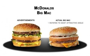
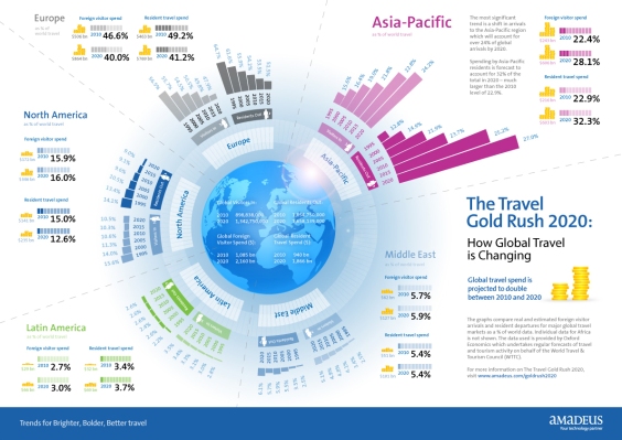
Some visuals are misleading as they give a wrong idea or impression. In the case of the advertisement of the McDonald (see above), the Big Mac looks more attractive in the advertisement than in reality. When you look closer to the infographic (see below) you will see that some features are also deceiving (e.g. the infographic appears to suggest that the travel industry is less dynamic in Europe than in the Asia-Pacific region).

Infographic bad

So, visualizations can deceive us, and this can be done in several ways. For instance, by truncating your x-as (e.g. are the top tax rates 5 times higher now?), by using 3D charts (e.g. is item C bigger than item A?), or by use of inconsistent scaling (e.g. is this a fair comparison?).

These misleading attributes can be implemented by the designers in one of the four editorial layers (i.e., data, visual representation, textual annotations, and interactivity), and it can be seen as a strategy to pick the right layer to deceive. Following Alberto Cairo, the most misleading visuals are based on the following three tactics:

  1. Hiding relevant data to highlight what benefits us;
  2. Displaying too much data to obscure reality;
  3. Using graphic forms in inappropriate ways.

Why are misleading visualizations bad? Jessica Hullman reported that even subtle changes in visualizations could influence responses. So, peoples’ interpretation and opinion could be altered towards an issue as a result of a misleading visual. In some instances this could have tremendous effect, for instance with emotional topics, such as racism, or decisive topics. The study of William C. Bradford suggested that over half of the people are visual learners. Supposedly, this is due because we understand visuals more easy as they affect us both cognitively (i.e., decode a text) and emotionally (i.e., strengthen our creative thinking). The study of Bruce I. Reiner reported that words are processed by our short-term memory whereas images go directly to our long-term memory. So, it seems that we remember the (wrong) interpretation extracted from a visual better than text. As a result, we could take action on the basis of false information.

Albert Cairo: “Charts, graphs, maps, and diagrams do not lie. People who design graphics do.”

Why do we use visualizations? We visualize to make stories or pieces of information more interesting and appealing (e.g. for commercial purposes, see McDonalds’ most finest hamburger), but also to make it more comprehensible and more easy to understand information {e.g. for informational purposes, see infographic}. We make misleading visuals to reach an objective that would be difficult or even impossible to obtain without ambiguous or false attributes. But, is it really a strategy? Do we make misleading visuals on purpose or could it be ‘just a mistake’? Please, look at the images below. Tell me in the comments if you thought they did it on purpose or if it was just by accident.

The visuals above are, in my opinion, both beautiful, but a little misleading. The first infographic shows the state individual income taxes collected per capita with some nice illustrated coins. But, a critical remark on this infographic could be that they only demonstrated the income taxes and they did not relate this to other interesting features, such as GDP. Another remark is that they didn’t elaborate on the source they used which makes it less accurate. The second visualization, which shows the Citeology, is beautiful, but it shows too much detail. This makes the infographic less functional.

How can we make good visualizations? David McCandless suggest that the key components of a data visualization are: interestingness, integrity, form and function. What does he means with this? One the one hand, the information in the visualization needs to be interesting (meaningful & relevant) and have high integrity (accuracy & consistency). On the other hand, the design of the visual needs to have form (beauty & structure) and function (easiness & usefulness). Alberto Cairo uses similar terms; he mentions in his video presentation that many visualizations today are beautiful, and even functional, but not particularly insightful.

Albert Cairo: “It is unacceptable to sacrifice the integrity of the data just to make an infographic pretty.”

Lastly, I want to give you some tips to make your visual worth watching:

  1. Think of what your audience is seeking;
  2. Identify the story you want to tell them;
  3. Sketch before you produce your story.

On a final note: don’t get fooled by misleading visualizations, use your bullshit detector! Do you know how your bull-shit detector works?Bullshit

Caught in a frame

Please read the following headlines of a news article:

[A] Global warming Will Not Be Dangerous for a Long Time
[B] Climate Change Will Not Be Dangerous for a Long Time

Would you interpret these headlines differently? How are they different? Is it just a word or is it more than that? In today’s blogpost I will tell you something about framing in news articles.

A threesome of agenda setting, framing and priming
The basic assumption of media effects is that press and media do not reflect reality; they filter and shape it. It starts with agenda setting. Agenda setting is basically the ability of news journals to influence the salience of topics on the public agenda. If a news item is covered prominently and often, news readers will perceive the issue as more important. According to Scheufele and Tewksbury, framing is a more refined version of agenda setting. Framing means making aspects of an issue more salient through different modes of presentation leading to a shift in people’s attitude. More specifically, framing constitutes of highlighting some aspects, such as an aggressive word, and excluding other elements, such as the right context. With this, framing tells us how and why to think about an issue. To complete the circle of the three media effects, there is priming. By offering your news readers a prior context – a context that can be used to interpret subsequent information – you can prime their opinions towards the positive or the negative.

Framing and its effects
I want to address the effects of framing more extensively in this blogpost because I think that framing has the largest consequences. It highlights certain aspects of an issue over other aspects resulting in strengthening or weakening pre-existing beliefs, attitudes, and opinions. Tversky and Kahneman demonstrated this with the Asian Disease Problem; in their study a significant amount of people chose the more risky option because it was framed more positively (the gain-frame).

Following Fairhurst and Sarr, there are seven framing techniques:

  • Contrast: define something in terms of what is not;
  • Metaphor: frame a conceptual idea by use of a comparison;
  • Stories: frame an issue in a vivid and memorable way via narrative;
  • Tradition: use cultural mores that pervade significance in the mundane;
  • Artefact: frame with objects that have intrinsic symbolic value and meaning;
  • Slogan, jargon, catchphrase: make use of a catchy phrase to make it more memorable;
  • Spin: present a concept in a way that has a value judgement (positive or negative) that might not be obvious immediately.

Shooting

The news makes extensive usage of framing. Yesterday there was a shooting in San Bernardino, America. Concerning this topic, news reporters can choose to focus on the fourteen victims or they can choose to focus on the shooting itself. How they frame their story can influence peoples’ attitudes and behaviour. Another news report about the same topic mentioned that the shooters potentially had terroristic motivations. Even though this claim has not been proven yet, they published it. As a result, people’s negative attitude about terrorists could increase and it is likely that they will be more terrified of terrorist attacks. On the same line, the study of Cosand reported that scripted news reports involving crime affected the level of fear, anger, and empathy.

Framing: are we doing it conscious or unconscious?
Some say that news reporters frame consciously and others think it is an unconscious process. In my opinion, we are all biased by the information that is presented to us in various ways so we have a frame of reference. Because of this, it could be almost impossible to write something without using a framework. Hence, I think we usually frame unconsciously, but with some activities, such as creating catchy titles (e.g. caught in a frame), it might be conscious.

In the first section I asked you if you would interpret sentence A [Global warming Will Not Be Dangerous for a Long Time] different compared to sentence B [Climate Change Will Not Be Dangerous for a Long Time]. There is a minor variation between them, but I perceive them differently. In my opinion, climate change is a more broad and neutral term whereas global warming elicited more negative associations. So, I might be more happy/relieved to read headline [A]. What is your opinion?

P.S. When was the last time you were ‘guilty’ of framing?

Blog4

Get the opportunity to publish (bias)!

Even though it is unintentional, scientist are misled by their own biases. I previously mentioned one of the biggest biases of confirmation, but that is not the only bias people have. In this blogpost, I tell you something about the opportunistic bias and publication bias.

Jamie DeCoster: “The opportunistic bias occurs when the reported relations are stronger or otherwise more supportive of the researcher’s theories than they would be without the exploratory process.”

The opportunistic bias occurs when researchers examine multiple analyses before deciding which one to actually use. This selection process makes it more likely to find significant results and large effect sizes because you can pick the analysis that favors your expected prediction or theory most. But, according to DeCoster and Sparks there are different procedures that shift your result towards significance; you can create an opportunistic bias by examining the most preferable way of transforming variables, measure a large collection of variables and only report desirable results, and examine the same hypotheses with different analyses, methods, or in different subgroups of participants. Another possibility is scrutinizing undesirable findings more closely than desirable findings (e.g. double-check the unexpected finding). Michèle Nuijten also mentioned several activities and she noted the self-admission rates of professors. Below you’ll find the three most frequent procedures:

  1. Failing to report all of the study’s dependent measures (63.4%);
  2. Deciding whether to collect more data after looking at the results and their significance (55.9%);
  3. Selectively reporting the studies that worked (45.8%).

As a consequence of the opportunistic bias, type I errors are easily made. Also, p-values can’t be interpreted as they should be because the actual probability of finding a significant result is much higher. Hence, opportunistic bias can lead to a significant effect (even when no effect is there). These wrongly drawn conclusions are incorporated in the general view in literature (as people and researchers read biased articles) and they systematically influence meta-analyses.

Why do we want these significant results so badly? Why do we transform data in a preferable way or do different analysis to get these significant results? One of the causes of the opportunistic bias is closely related to the publication bias.

Michèle Nuijten: “Publication bias is putting the non-significant results in the closet and publish the significant results in the journals.”

With publication bias, the whole view in literature gets distorted; by only reporting the articles that have significant results, researchers get triggered to (only) publish significant results and this stimulates the opportunistic bias increasingly. The view on the world changes and the (scientific) knowledge we have is not as objective as it should be. This could be dangerous in the field of medicine for instance. Publication bias is not only noticeable in the scientific world, but also in journalism. For journalists it is important to create remarkable and sensational stories in order to get people to read a blog/newspaper and get paid by their bosses. With this, incorrect and biased information is (even more) encouraged in our society resulting in a misguided worldview.

The problem is clear: the motivation of the opportunistic bias is closely related to the publication bias. What can we do about it?

[1] Researchers must create reliable articles with as little as possible (publication and opportunistic) biases. They should also make use of preregistration by means of the website OSF (which does not allow you to change anything when posted on). When referring to other toonvectors-12587-940articles or previous theories, they should be cautious. To indicate if an article is adequate, researchers could look for bad and good signs.

Bad signs:

  • Statistical errors;
  • Lot of p-values just below .05;
  • Post hoc explanations of covariates;
  • Removing outliers without doing a sensitivity check;
  • Vague and inaccurate language in the method section;
  • Degrees of freedom that don’t match the sample size.

Good signs:

  • High power or large sample size;
  • Preregister hypotheses, method and analysis plan;
  • Openness (share data, analyses, material online);
  • Replication with high power and preregistration;
  • Meta-analysis of different studies (test for publication bias).

[2] What could journals do? They could create a more rigorous and thorough reporting standard (e.g. reporting the intended and the actual sample size, describing all variables, mention the analyses which were pre-specified and which were done). In addition, journals could require an increased disclosure (e.g. researches have to write a log of all performed analyses and procedures). In my opinion, journals should also publish non-significant results because this is also a result. They can do this by accepting or rejecting research proposals on the basis of their theory, described method and proposed analysis. When it is accepted, the jourjournalnal would agree to publish it no matter if the results are non-significant. I do think that the latter should have some other requirements to uphold the quality of research papers though.

[3] What can be done by journalists? Journalists should be cautious when referring to an article. In my opinion, a lot of journalists are not doing this; they are rather sensational instead of subtle. An example of this can be found in the news report “Even Casually Smoking Marijuana Can Change Your Brain, Study Says” of the Washington Post. The study they refer to solely indicated that there were differences in the brain of casual pot users compared to nonusers, but it did not mention that journalist-writing-notebook-neck-has-pass-31951626these differences were caused by marijuana use (because it even couldn’t show causality because of the study’s design). In this sense, journalists should be critical and more skeptical and not just write something that is exciting.

Big brother is watching you

Big data is a hot topic at the moment, but what is ‘big data’ exactly? According to Lewis and Westlund, big data refers to data sets that are too large for standard computer memory and software to process. By analyzing big data you can reveal patterns, trends, and associations. Big data gives us the opportunity to integrate information from different sources and recognize/predict various patterns. These patterns are usually related to human interactions and behavior. With this, big data could be very important for the implementation of marketing activities.

JDA22

For instance, when you are the marketing manager of the Dutch supermarket cooperation Albert Heijn. Albert Heijn makes use of the “Bonus-card”, a card with which you retrieve discounts on products who are in the “Bonus”. Every time your card gets scanned, Albert Heijn receives information about your consumer behavior and interactions (e.g. you come every day to buy at least one Tony’s chocolate bar). So Albert Heijn knows what you are going to eat this day or week. By means of the Bonus-card they can effectively design marketing campaigns (e.g. hamster weken) because they have insight in you as customer. Almost all regular customers of Albert Heijn have a Bonus-card so it is a smart way to gather data and, subsequently, predict purchase behavior.

In the example above I wrote about data collection in a physical environment, but the same (and probably more easy and often) happens in the non-physical environment, such as the Internet. The Internet has numerous ways to retrieve data (cookies, Google, YouTube, social media interactions, location-based services etc.). Some ballpark figures of real-time data online (20/11/2015 15.00):

  • Videos viewed today on YouTube: 6,027,000,000
  • Photos uploaded on Instagram: 162,630,000
  • Google searches today: 2,787,425,000
  • Facebook active users: 1,499,923,000
  • Blog posts written today:2,577,000
  • Tweets send today: 571,955,000

Data can be implemented for commercial purposes. For instance, when Google knows that you love Tony’s chocolate and you repeatedly purchased it online at Albertheijn.nl, you might receive banners or advertisement of both Albert Heijn and Tony’s chocolate when surfing online. In some respects, both in the offline environment (i.e., Bonus-card) as the online environment (i.e., www.albertheijn.nl) we are being followed, or some would say stalked. A logical follow-up question would be: Is this ethical?

To answer these questions, I would like to give special attention to social medium Facebook as it is very popular and it is a medium that retrieves lots of data. Facebook collects data on the basis of your own activities on Facebook (e.g. posting a picture of you and Tony), but also when other networks or people deliver information about you. Hence, privacy depends on your friends on Facebook. In addition, Facebook assembles data concerning payments, device usage and data from websites that collaborate with Facebook, such as advertisers. This is what they say on their ‘privacy page’. But, what is the deal with image recognition and extracti222ng data from that. Eric Postma mentioned that faces, emotions and objects can be recognized in images. If Facebook starts using this technique, more questions could be raised with regards to privacy and ethics.

But, that is not the only thing that they do; Facebook carries out research with Facebook-users as (unknown) participants. Kramer, Guillory and Hancock did a research about emotion contagion through Facebook. In their study they showed that when more positive posts were suppressed in people’s news feed, less positive expressions were posted. When negative expressions were reduced, the opposite pattern occurred. An interesting study, but (again) questions arise about ethics as participants were not aware of their participation.

In all, lots of data is assembled though Facebook, but are Facebook-users aware of this? In my opinion, people should be made aware of the activities of Facebook; the image processing, their research studies, and all other data gathering activities. Smith, Szongott, Henne and von Voigt also seem to agree with this. By creating awareness, people get a real choice to unsubscribe if they feel their privacy is invaded. Although I think that most people are aware of the fact that posting information online can be traced back to you, some people are not aware of this (e.g. children). Also, as I mentioned earlier, your privacy is depended on your friend.

To conclude, big data creates opportunities for marketers but it also raises questions about privacy and ethical dilemmas. Both Albert Heijn and Facebook retrieve data and use it for their own commercial purposes, but they do it differently. Now my question to you is Would you be more comfortable with the Albert Heijn approach or with the Facebook approach?

JDA2

Stories are subject to subjectivity

How someone’s judgement is shaped by personal opinions and feelings not only influences the way one tells a story, but also how someone finds a story. In this blogpost the latter has the main focus as I have tried to find a common problem in finding data to support stories and a common pitfall in finding story ideas with data analysis.

Every day stories are told in the news; sometimes a terrorist attack is the main issue and often political activities are situated in news articles. Galtung and Ruge provided insight in the predictive pattern of news articles. They provided a list of different factors, such as incorporation of unexpected facts, and they predicted that when events score high on the list, the more likely they will occur in news articles. One of the factors was ‘threshold’. With this, they meant that the greater the intensity and the more casualties involved, the more likely the event will be reported in the news.newspaper27

In a different review, Hardcup and O’Neil showed that this list is subject to subjectivity. They reported, among other things, that the threshold is open for subjective interpretation as someone might think that 20 deaths in ten road accidents is worse than five deaths in one rail crash. They also stated that news is more likely to be news if it is culturally similar. For instance, if the same accident happens in a country that shares your cultural values opposed to a country that doesn’t, the former would be more likely to be newsworthy. Moreover, Hardcup and O’Neil reported that a news agency’s own agenda could also play a role in selecting articles due to commercial interests. In sum, in the process of selecting a news article subjectivity plays a role. However, the influence of subjectiveness prevails in a more early stage of data journalism.

In order to report a story, a news reporter has to do a data analysis. Following the inverted pyramid of Data Journalism of Paul Bradshaw, a news reporter goes through several processing stages in order to establish his story. In order of sequence, these are: compile, clean, context and combine. When all processes are gone through, a story can be build and communicated to the world. However, different things go wrong in the process of finding data to support stories and the process of finding story ideas with data analysis.

What can go wrong in the process of finding data to support stories?

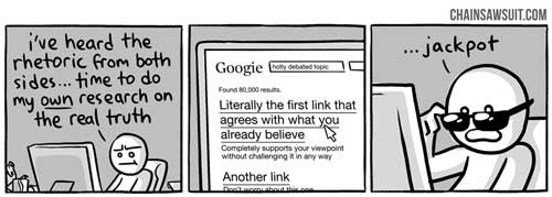
In the compiling phase, one of the most important steps in journalism, news reporters search for data and see whether data is relevant or not. In this stage, a common pitfall is the urge to look for information that is consistent with one’s own expectations, beliefs or hypothesis – a phenomenon called the confirmation bias. With this, news reporters might be more reliant to seek for datasets that confirms their expectations and interpret data in a way that is consistent with their own believes. This affects both the data analysis process and of course indirectly the news article itself. For instance, you believe in democracy and its benefits. When writing an article, you only search with key terms that are consistent with your existing believe, such as “positive effects democracy”. The image below gives an illustration of the confirmation bias. Thus, there is a clear difference between building a case to justify a conclusion which was already drawn and impartially evaluating evidence in order to come to an unbiased conclusion. Motivational factors for the existence of the confirmation bias might be that it is more time consuming, it leads to cognitive costs (e.g. generating new ideas), and it is also not good for the self-esteem.

Confirmation Bias

What can go wrong in the process of finding story ideas with data analysis?

Another process in which biases often occur is in the combining phase. In this phase, journalists look for patterns and how to combine data together. A common pitfall in this stage is that journalists see an illusory correlation. With this, individuals perceive a correlation between variables (often events, behaviors or people) even when no such correlation stands. This bias is actually related to the confirmation bias because former expectations play a dominant part in this process. For instance, you (still) believe that democracy is best, so you try to relate democratic countries with fewer murder cases than countries with a dictatorship. When you don’t find a pattern, you think that you might have chosen the wrong variable so you look further for a variable such as ‘life satisfaction’. You find that there is a significant relationship between life satisfaction and democracy. However, you do not take into account that wealth or richness is a confound or mediator. So, you’re left with an illusory correlation based on your own subjectivity.

Subjectivity and its consequences

Writing news reports on the basis of subjectivity has implications. Among others, Wanta, Golan, and Lee did research on media influence on perceptions of foreign nations. Their results showed that participants perceived a country as more negative when it received more negative media coverage. Positive media coverage, on the other hand, had no influence on public perceptions. So when a news reporter is negative about, for example, a minority group and he is led by his confirmation bias and/or an illusory correlation, his news report is rather subjective and (more) negative about that minority group (than needed). This affects readers and it might enhance negative stereotyping.

Thus, subjectivity plays a role in different facets of writing news reports and it has effects on news readers. The two most important phenomena are the confirmation bias and the illusory correlation bias which are present in the first and last stage of the inverted pyramid of Data Journalism. So, please be aware of these fallacies when writing a news article! You can do this by being objective and critical. Don’t do research with key terms that are consistent with your own beliefs, but be open-minded and use antonyms in your data research. When finding patterns in data, take into account that there could be confounding variables or mediators/moderators that affect the outcome.

Don’t get fooled by your own stupid.. subjectivity!

How would you uphold your objectivity when writing a news article?